To make a report, click Report | New Report in a current iChart project file. The Report Tool will appear to the right.
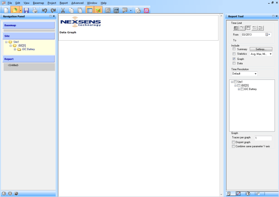
Figure 1: Report Tool in respect to iChart layout
The four tabs at the bottom of the Report Tool are from left to right: General, Graph Properties, Output and Advanced.
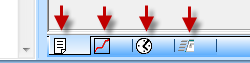
Figure 2: Tabs in Report Tool. Left to Right: General, Graph Properties, Output and Advanced.
From the General Tab, select the Time Limit, information to Include, the Time Resolution and general Graph information.
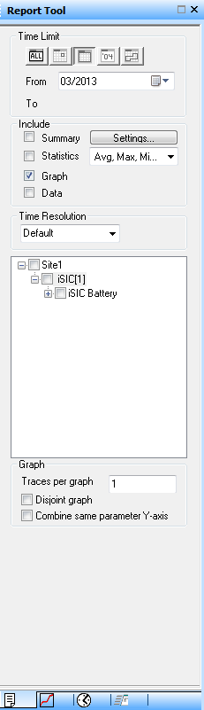
Figure 3: Report Tool
Time Limit
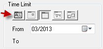
Figure 4: Time Limit. From left to right: ALL, Daily, Monthly, Yearly and Custom.
ALL – Includes all data from the iChart database in the report.
Daily – Includes all data from the selected day in the report.
Monthly – Includes all data from the selected month in the report.
Yearly – Includes all data from the selected year in the report.
Custom – Includes all data between the selected dates in the report.
Include
Reports generated by iChart may include a project summary, data statistics, graphs or data tables. Place a check in the boxes to include in the report.
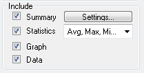
Figure 5: Include
Summary – Displays a Summary within the iChart report. This includes site information and description, device profile and a report summary.
Statistics – Displays a statistical summary for each parameter in the report. This includes the number of samples, average value, minimum value, maximum value and the standard deviation for each parameter.
Graph – Generates separate data graphs for each parameter and displays them within the iChart report. Graphs will include data from the time-frame selected and generate as line graphs by default.
Data – Displays data for each parameter in tabular format.
Settings – Click the Settings button to open the Report Summary window and enter specific information into the the Summary section when it’s included in a report. Uncheck Show field note to keep field notes from appearing on reports.
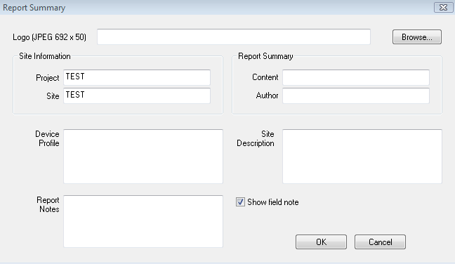
Figure 6: Report Summary window
Time Resolution
iChart lets users auto-align data based on time. The feature is useful when generating reports using multiple sensors that don’t necessarily have the same time interval between data points. No data alignment is selected by default. Select the desired Time Resolution. Options include Default, Hour, Day, Month, UserDefined and None. Selecting UserDefined lets users align data by minutes.
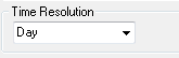
Figure 7: Time Resolution
Parameters
To include parameters in the report, click on the “+” marks in the selection tree(s) to expand the parameter selection. Place a check in each box next to parameters that will be included in the report. By default, iChart will not select any parameters. Once a new parameter is selected, the report will update instantly. Depending on the amount of data in the database, there may be a small pause. Wait for iChart to update the report before selecting another parameter.
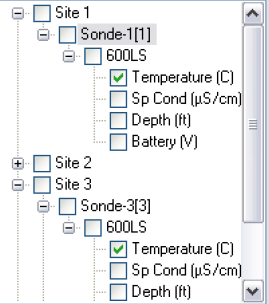
Figure 8: Parameters in selection tree
Graph
The Graph section lets users set the number of traces per graph, disjoin graphs or combine Y-axes.
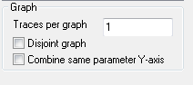
Figure 9: Graph
Multiple traces can be placed on a single graph from the Traces per graph box. The feature is useful when comparing multiple parameters to determine if there’s a correlation.
The Disjoint graph option allows users to show gaps in the graph where there are missing data points. By default, graphs will display lines between missing data points.
Check Combine same parameter Y-axis to combine the Y-axis of each trace in the graph and redraw the trace as needed to fit the new Y-axis. When graphing multiple parameters, multiple Y-axes will show on the graph if this option is not selected. Note that this feature only works for parameters of the same type.
Graph Properties Tab
The Graph Properties tab lets users customize graph features such as limits, appearance and titling.
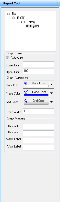
Figure 10: Graph Properties
Graph Scale – In this section, Autoscale enables auto-scaling of the graph for the selected parameter. Autoscale is selected by default. Lower Limit sets the lower Y-axis limit for the graph of the selected parameter. Upper Limit sets the upper Y-axis limit for the graph of the selected parameter.
Graph Appearance – Here, Back Color controls the background color for the graph of the selected parameter. Trace Color is the line color displayed on the graph of the selected parameter. Note that traces on the same graph can’t be assigned the same color – iChart will automatically change trace color as necessary. Grid Color is the color of the grid lines displayed on the graph of the selected parameter. Trace Width is the width of traces on the graph for the selected parameter.
Graph Property – Lets users assign titles for lines 1 and 2 and change the labels assigned to the X- and Y-axes. By default, the X Axis label is “Date” and Title line 1 is the iChart project name.
Output Tab
The Output Tab is used to set up automatic reports. For more information on enabling automatic reports, see this article. This tab controls how reports are generated in a number of different formats and allows for sending them to many different locations.
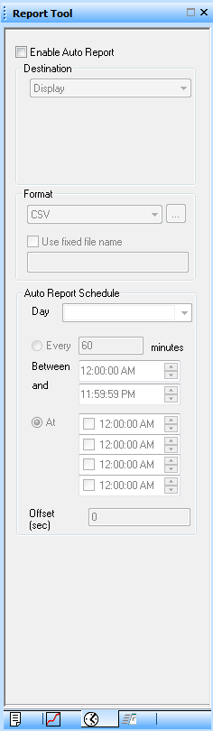
Figure 11: Output tab
Enable Auto Report – Must be checked to enable automatic reports.
Destination – Controls where automatically generated reports are sent. Options include Display, Printer, Email, FTP and Folder. Selecting Display will show reports on the PC main screen. Printer sends the reports to the computer’s default printer. Selecting Email will send the reports to a specified email address. The FTP option will send reports to an FTP server. Folder will send reports to a specified folder that may be located on a local computer or local area network.
Format – Controls the type of file the report is saved as. Options include CSV, IDB, PDF, XLS, NDBCXML and GLOSXML. Selecting CSV will save the report in CSV format. The IDB option will save the report in iChart Database Backup format – reports generated in IDB format may be opened directly in iChart by clicking File | Import. Choosing PDF will save the report as a PDF. The XLS option will save the report as a Microsoft Excel file. The NDBCXML selection will save the report in an XML format usable with the National Data Buoy Center. Choosing GLOSXML will save the report in an XML format usable with the Great Lakes Observing System.
Use fixed file name – allows users to use the same file name every time iChart saves a report. iChart will overwrite previous reports generated with this file name.
Auto Report Schedule – Scheduling options for automatically generated reports. Place a check next to each Day auto-reports will be generated. Select Every to generate periodic reports, with the value entered in minutes being how often iChart will generate a report. iChart can update reports Between certain times entered in this field. When enabled, the At option can be used to make iChart update reports only at times indicated in one or more of the four time boxes. Offset (sec) allows for forcing iChart to wait a number of seconds before updating a report.
Reports can be exported to Microsoft Excel or converted to PDF and saved in a local folder. Click the PDF icon on the Main Toolbar to output the current data report in Adobe Acrobat PDF format. Click the Excel icon on the toolbar to export to Microsoft Excel.

Figure 12: Export Reports to Adobe Acrobat PDF or Microsoft Excel
Advanced Tab
The Advanced tab allows for controlling targeted features like specific outputs, data ranges and graph markers.
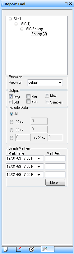
Figure 13: Advanced tab
Parameter – Select a parameter from the list to configure advanced options. Changes made to one parameter won’t affect settings of those made to other parameters. Settings for multiple parameters can be configured by selecting its parent in the selection tree. Then all the parameters under that selection will take the settings changes.
Precision – Sets the number of decimal places (up to 6 decimal places) for data shown in statistics, graphs and data tables.
Output – Note that selections made in this field will show data for the time period defined in the General tab of the Report Tool. Avg will display average values in the report. Min will display the minimum occurring value in the report. Max will display the maximum occurring value in the report. Checking Std will display the standard deviation in the report. Selecting Sum will show the sum of the recorded values in the report. Checking Samples will display the number of samples recorded during the defined time period in the report.
Include Data – This option allows for filtering data that will be displayed in the report. Selecting All will display all the data. Checking “X<=” lets users filter data above the value entered. The “X>=” option lets users filter data that is below the entered value. Selecting “<=X<=” lets users filter data outside the two values entered.
More – Click this button to bring up the Graph Marker window.
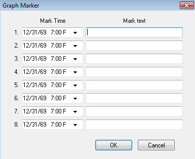
Figure 13: Graph Marker window
The Graph Marker window allows for up to eight time events to be marked on graphs in reports. From the Mark Time drop-down, select the time and date. In Mark Text, enter the text to be displayed. This feature is useful in marking times when a system was offline or a sensor was being calibrated, etc.
REV: 13L28